
Artist Insight with Michael Block (@mblockk)
We are so excited to welcome Michael to the AOV family. We had the chance to get to know him and he has created amazing presets for the community that are shown below.
Tell us a bit about yourself.
My name is Michael Block, I’m 29 and have been pursuing photography seriously for about 4 years. I’m from Los Angeles, CA, but currently live in NYC. Photography became my passion initially out of frustration for not being able to photograph things in a way that captures their full beauty. This frustration, in combination with a passion for exploration and the outdoors, led me to keep trying and honing my shooting and editing skills. I think that it’s impossible to capture a subject’s entire scope, at a basic level because everyone sees things differently, but I endeavor to make photographs that closely resemble the experience as I had it. I hope you enjoy it.
What tips and tricks do you have for the community?
Shoot everything, often, and shoot a lot of it. I can’t tell you how many times I’ve uploaded photos and when looking at them thought of different, better ways I could have composed the image. By taking way more shots than you actually need, it becomes easy to train your eye to what you like in the editing process. It’s better to come away from the once-in-a-lifetime moment with too many photos than too few.
On the editing front there is a few things that I consistently do.
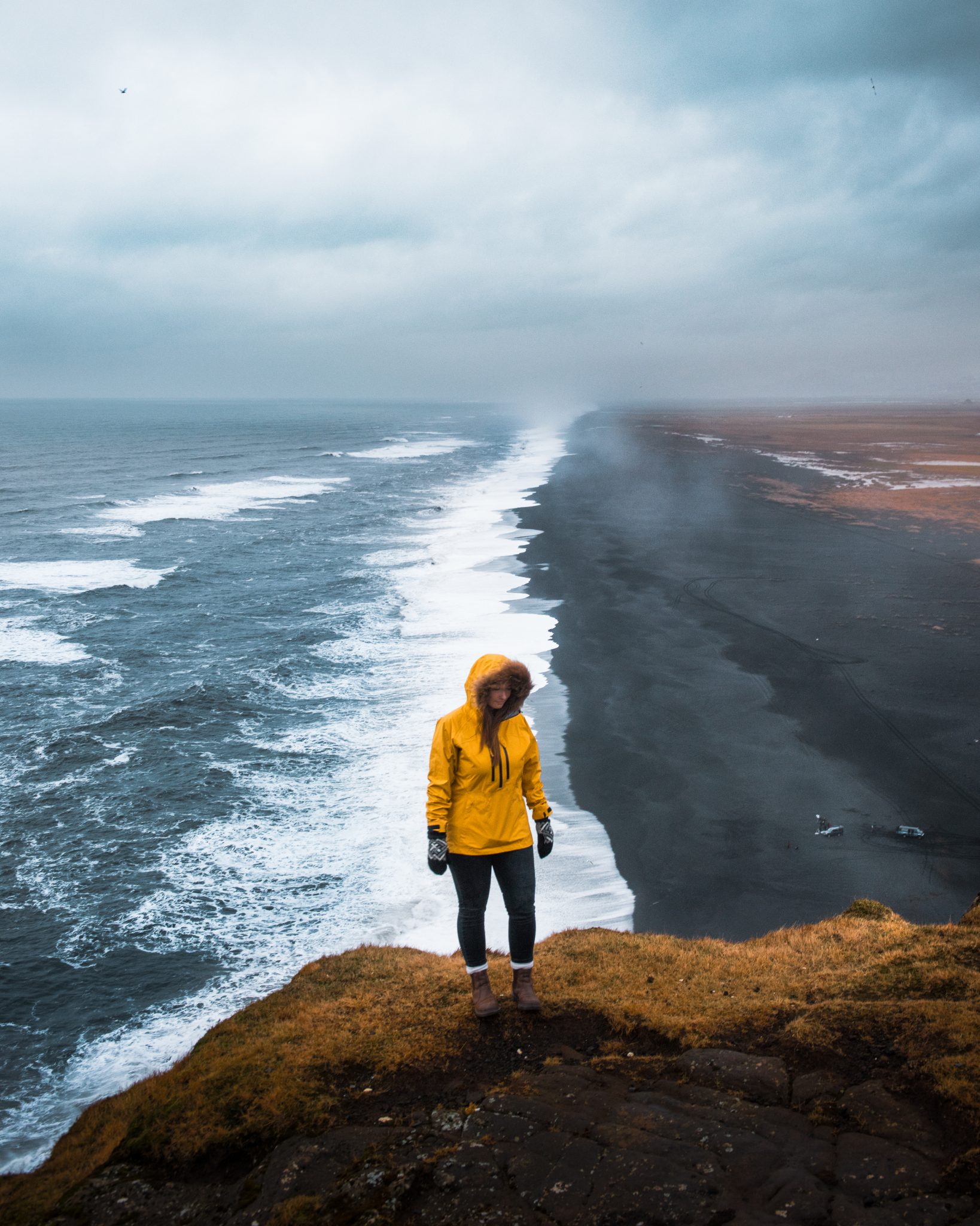
-I don’t love the way yellow looks in my photos. Yellow is in everything, and you’d be surprised how much a photo’s aesthetic changes when you desaturate yellow.
-While I used to prefer a more faded look, In the past year or so I’ve gravitated toward more contrast.
-Use gradients, brushes, and radial filters to adjust certain areas to pop more. I use these tools with saturation, clarity, contrast, and exposure. Both positive and negative.
How do you currently support your photography?
I take photography jobs where I can find them, and try to use that money to pay trips that I use to try and make more photography/collaboration opportunities.
Where did you create the presets?
New York City, New York, USA.
What are your goals with the presets?
Learning to use Lightroom to tweak photos exactly to my liking has been a task; I’m still learning to tweak and adjust things even after four years. I think presets are a great way for people to start overcoming the learning curve that comes with photo editing. We gravitate toward styles we like, and then we personalize them. I hope that my presets can be a tool for people to not only add edits they enjoy to their photos, but to serve as a jumping-off point for further adjustments that make their photos truly their own.
What gear do you use?
Nikon d810/ Nikkor 24-70 f2.8 / DJI Mavic
What do we get with your preset pack?
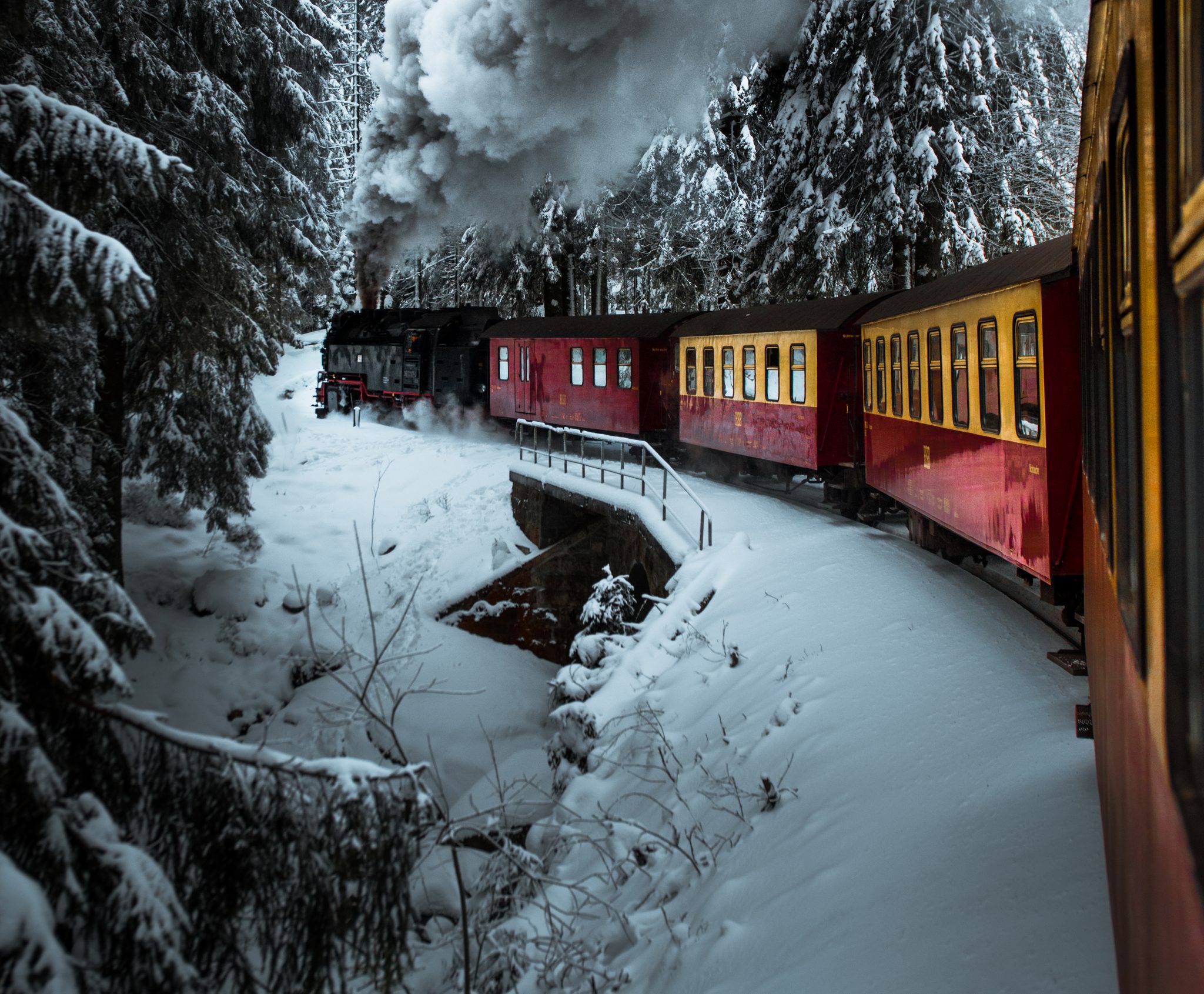
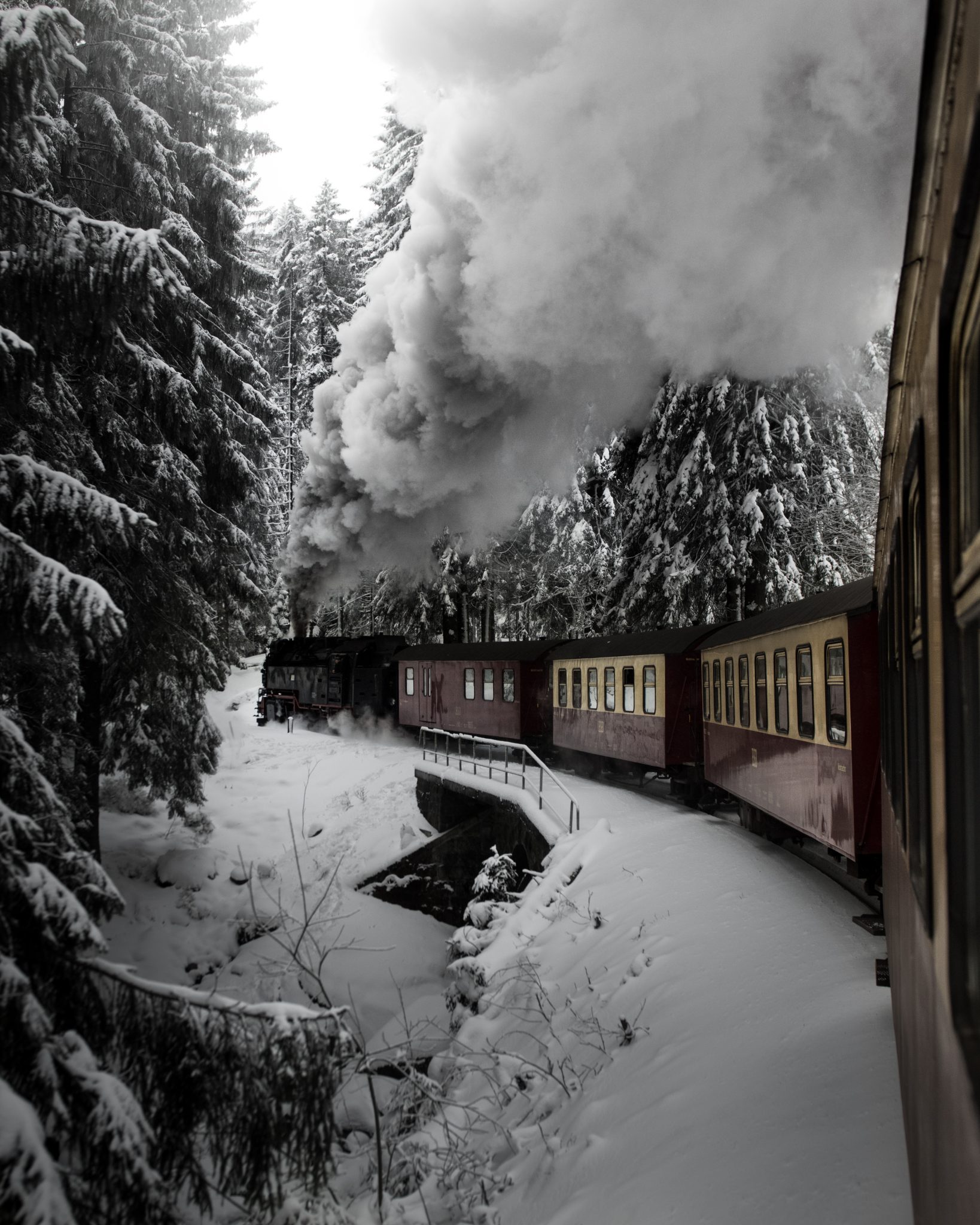
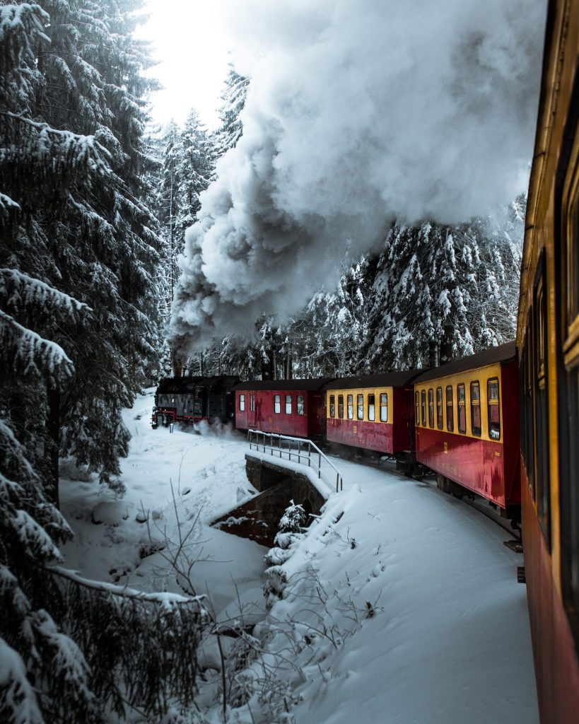
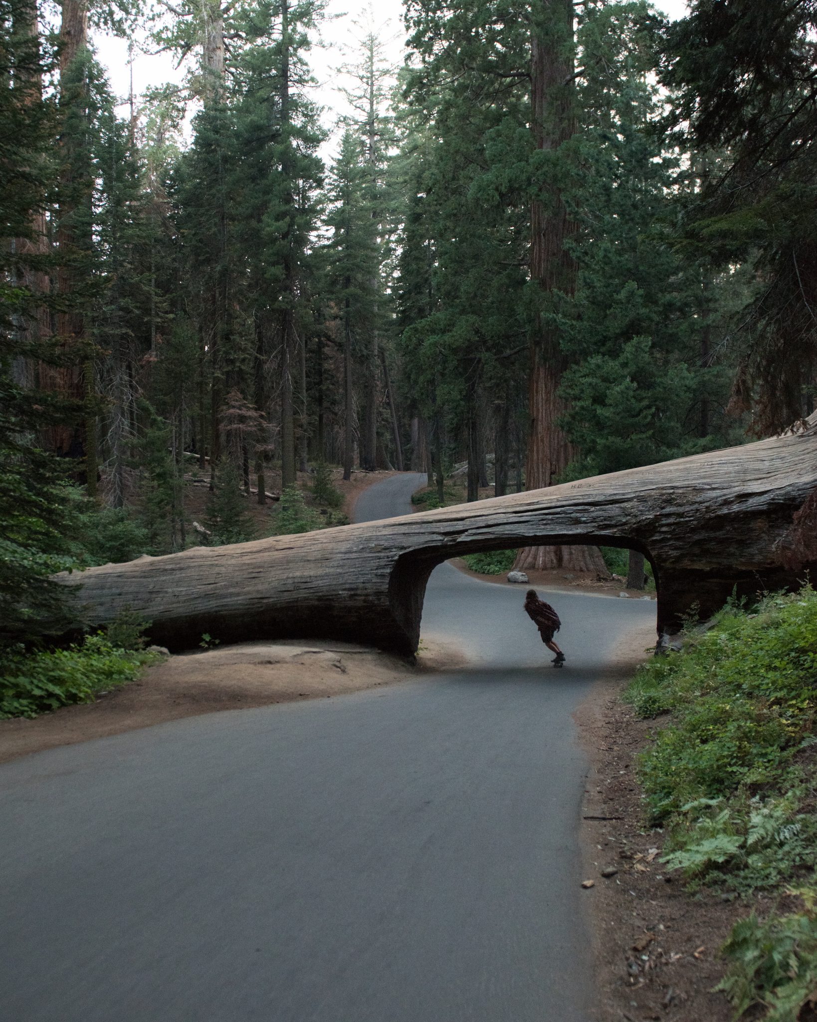
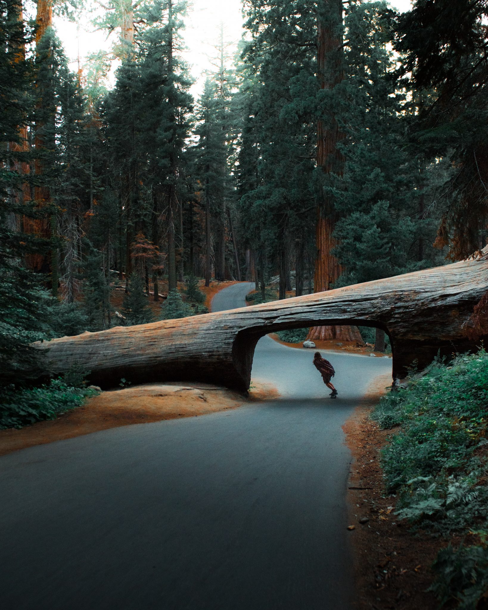
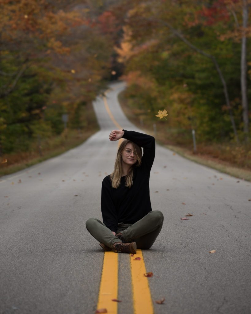
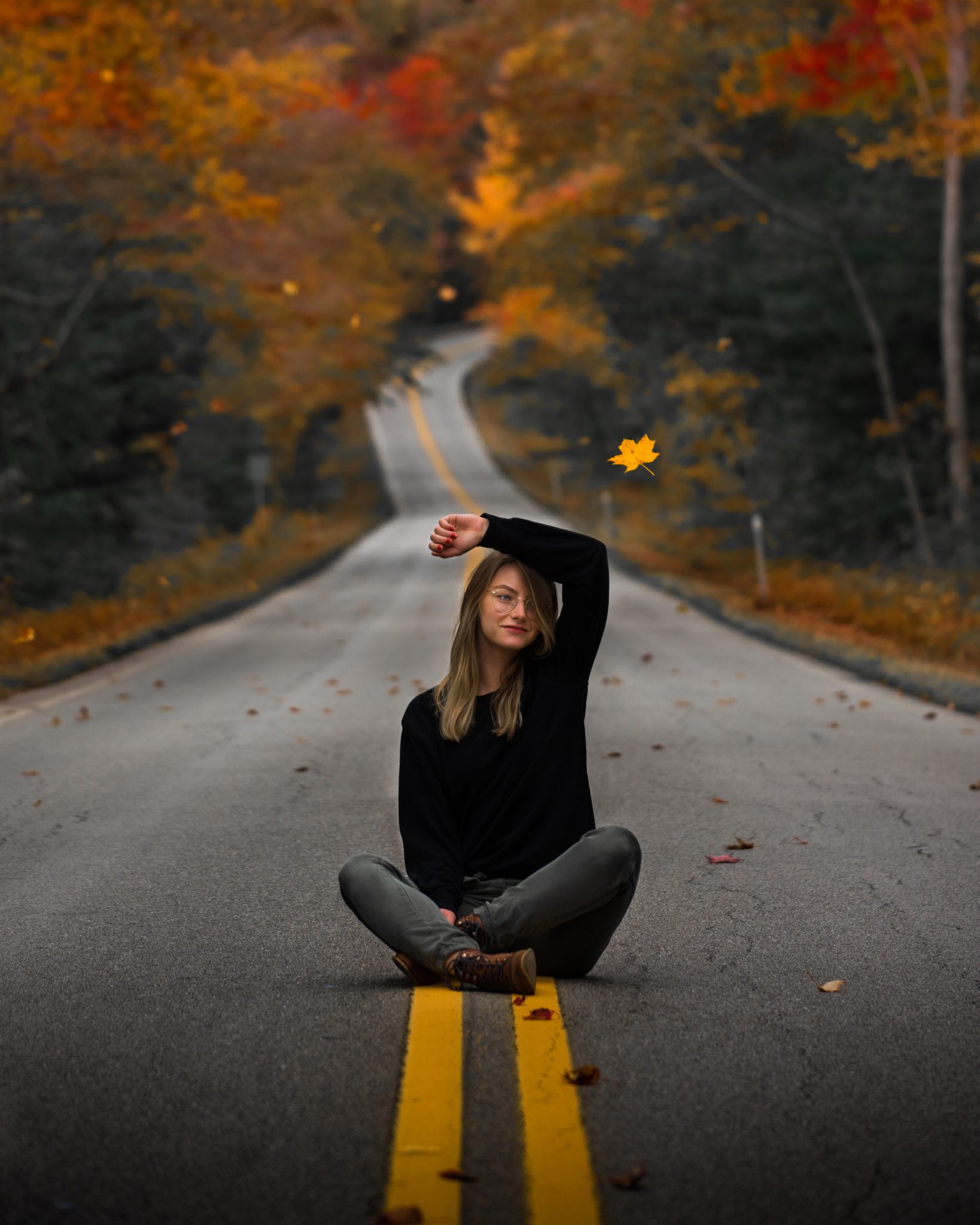
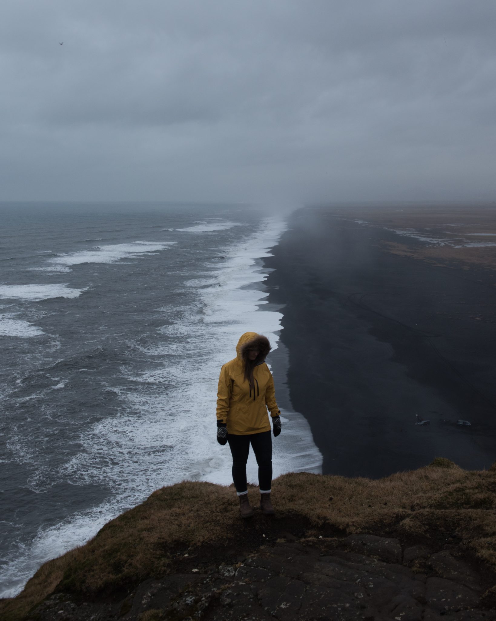
Fall: This pack is designed to accentuate the colors of fall. Reds and oranges dominate most of the presets, with some incorporating a strengthening of blues. As with most of my other presets, yellows have been desaturated to allow the other colors to shine through. Greens are also desaturated and made slightly teal, which draws further contrast into the color of the image.Winter: Most of these presets make use of Split Toning; a means of incorporating color into the lighter and darker parts of the image. The goal with these presets, with the exception of “Winter 1,” is to maintain the crisp, blue aesthetic of winter, enhance contrast, and make the shot vibrant in a way that counteracts the tendency for winter photos to fall flat. Winter 1 is designed for use with photos that already have a lot of blue, and to bring out the other elements of the shot. The “color temperature” or “warmth” of this photo might need to be decreased depending on how warm the images become after applying it.Spring/Summer: The least contrasty of the packs, Spring/Summer focus more on showcasing the softness of the landscape. Colors are split in a similar way to the Fall presets. Each of these presets focus on exaggerating certain colors, so their applications are vastly different. Try them out and see which you like best. Like the rest of the presets, I encourage you to learn to adjust them to your liking. No two landscapes have the same light, colors, contrast, etc., and these differences can be more dramatic during the sunnier months where light is abundant and plants are ever-changing.
Thank you for joining us in introducing Michael Block. Try out his new presets and take your photography to the next level!
[…] Read the @mblockk Interview here: https://artofvisuals.com/artist-insight-with-michael-block/ Michael Block Instagram: https://www.instagram.com/mblockk/", "thumbnailUrl": […]
LA/NYC? Your best is West!! Skip NY guy!